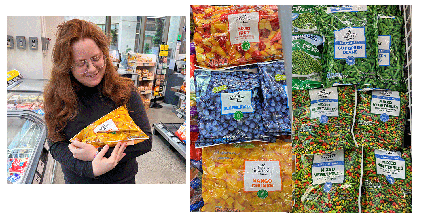
A private label brand initially developed for fresh produce, later adapted to Lidl's line-up of frozen fruits and vegetables. This brand offers a combination of the convenience and freshness for the best of both worlds.
PEAK HARVEST
Frozen produce gets a bad rep. Not only is it often in better condition than fresh produce, it's often more nutritious due to the flash-frozen qualities.
But how do you visually convey fresh produce inside the freezer?
→ We start by leveraging our existing fresh brand and studying consumer insights to determine the most important pillars for this category.
→ Creative development begins, using key and recognizable elements of the brand to convey to shoppers that this is the same great produce brand, now available frozen.
→ Develop packaging, coordinate photoshoots, and finalize labels. For this brand, extensive work was done to photograph fresh produce and retouch stock photography when needed.
→ Once designs are finalized, work begins with all suppliers for PDF and physical proof review to bring the artwork to the shelf.
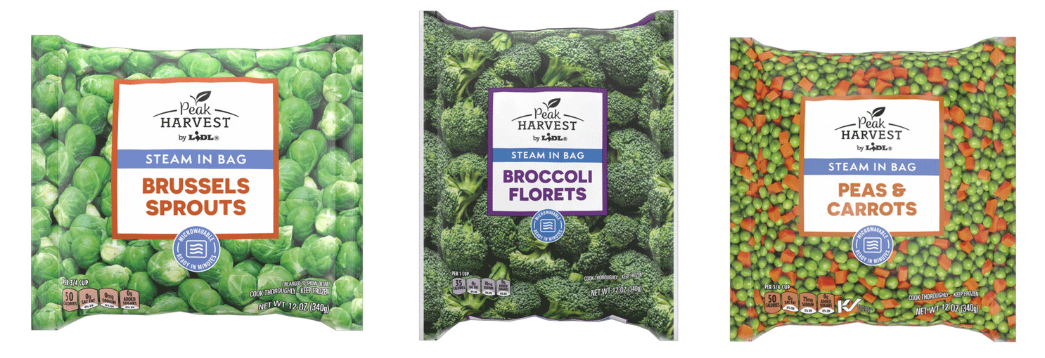
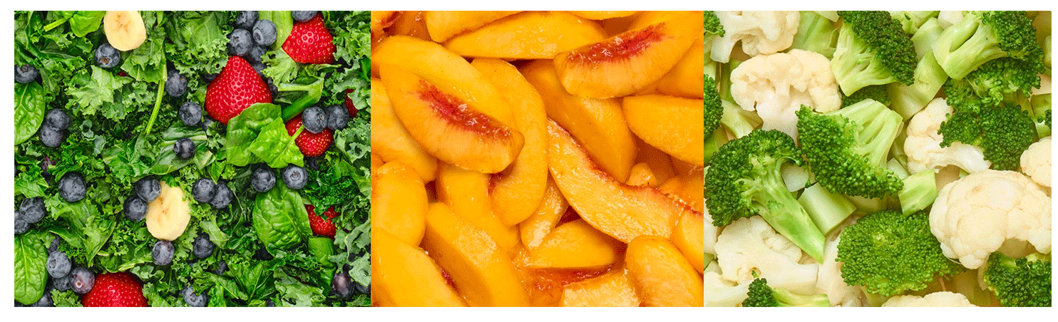
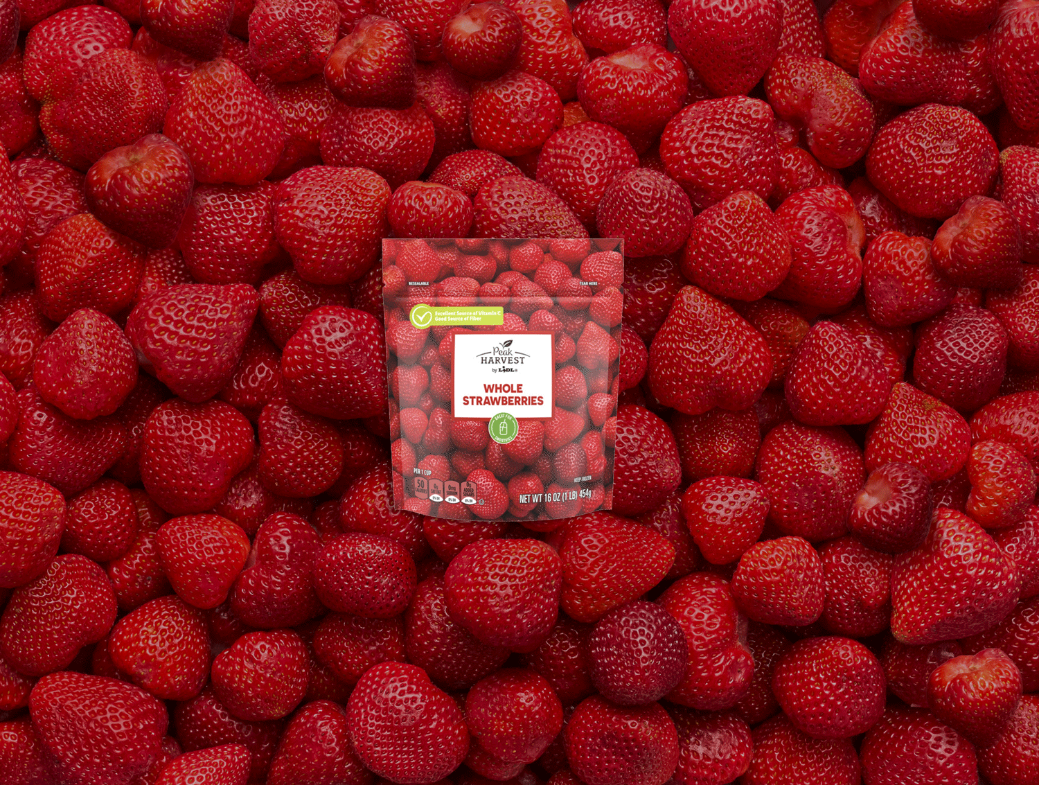
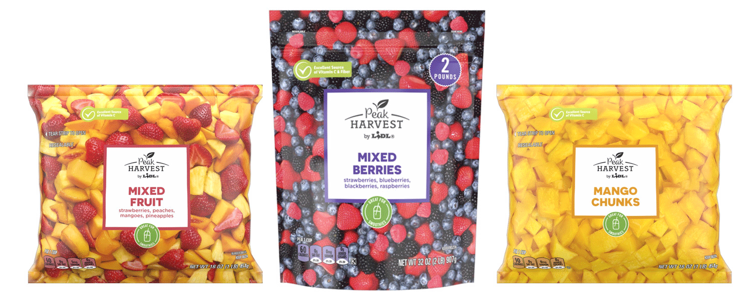
Photography is used to show produce at its best, completely covering the package. The natural lighting and abundant produce communicates our dedication to quality and creates a visual throughline with the visible produce in Peak Harvest’s clamshell and plastic bag offerings.
The flood of photography freshens displays and helps shelf navigation, making it easy for shoppers to select their favorite produce, and may even inspire feelings of maternal care.
Art Direction & Design: Susannah Grady, Matt Weiss, Remie Luong
Copy: Susannah Grady
Photography: SaltFire Studio
Food Styling: Debbie Shawcross